Claim Assignment dashboard
- See Navigating and Filtering Management Dashboards for clarification on how to customise this dashboard.
The Claims Assignment dashboard is a generic management dashboard that allows you to quickly view claims assignment statistics for your company. The dashboard is interactive and updates based on the filters that you select.
The dashboard includes claims from the past two years.
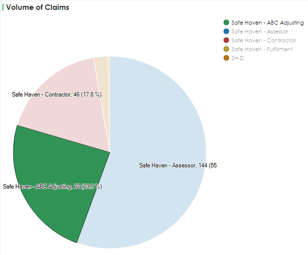
Volume of Claims
This chart breaks down which data set is working on the most claims. Hovering over a section allows you to see the actual number of claims and the percentage of total claims data.

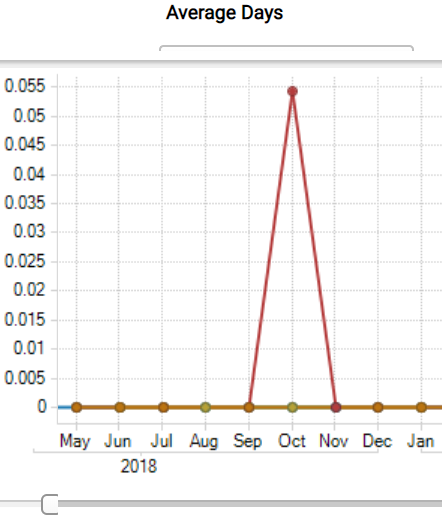
Average Days chart
The line chart in the dashboard displays the average response times for your selected areas over time. The chart automatically updates as you select different filters on the dashboard.

You can select one or more response time metrics from the View As menu above the chart. Each response time metric is represented by a different coloured line in the chart.
You can change the view of the chart to days, months, or years with the slide bar under the chart.
Claims Count per Type of Loss
This chart displays the number of claims for each type of loss. Each type of claim is designated by a different colour. Use the slider to focus on a specific type of loss. Hover over the bar for additional detail.

Claim Assignment Aggregation tab
To group different metrics together in reports:
In the Aggregated Measures page, select a group.
Select metric(s). You can select multiple options in a filter by holding the Ctrl button on your keyboard whilst you click on each option.
Send us feedback on this article
Copyright © 2005-2021 Xactware Solutions, Inc. All rights reserved.